Create a new dashboard
Dashboards allow for creating cohesive views of your data and processes. A dashboard is a set of widgets that can be organized and sized to create a control panel for a specific workflow, process or dataset.

Overview
Dashboards allow you to have a collection of widgets in one place. This simplifies visualizing and aggregating data from multiple different workflows, datasets and process elements.
Basics
Creating a dashboard
You can create a dashboard by opening the “Create” menu and selecting “Create a new dashboard”. This opens a modal that allows for naming your dashboard, after which an empty dashboard is created.
Adding widgets
Widgets are the building block for Dashboards, much like Actions are the building blocks for Workflows. Widgets are essentially a custom user interface that can be used to display almost any type of information. They can be used to show charts and graphs, documents and tables, fill out forms, and authenticate users.
Ordering and resizing widgets
In a dashboard, you can order and resize metrics freely. The first step is to press on the “Edit” button. This allows you to edit the size of the widget. Next to the “save” button, you will find two arrows. They allow you to move the widget around in the dashboard.
Copying a widget
If you would like to copy a widget from one dashboard to another or have multiple widgets with small differences in a dashboard, you can copy and paste widgets. Next to the “Edit” button, you will find the “Options” button, and it will open up a menu that shows documentation, as well as a “Copy widget” option.
Find the next available free slot in the dashboard, press the “Add” button, and press “Import widget”. The widget will be imported in JSON data format. Press “Add widgets” and the copied widget will be added to the dashboard in the selected slot.
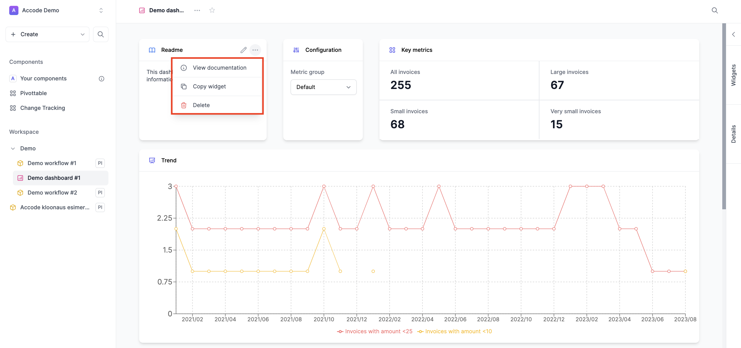
Widget documentation
To view documentation about a particular widget, open the widget menu (triple-dot menu). and select View documentation.
Examples
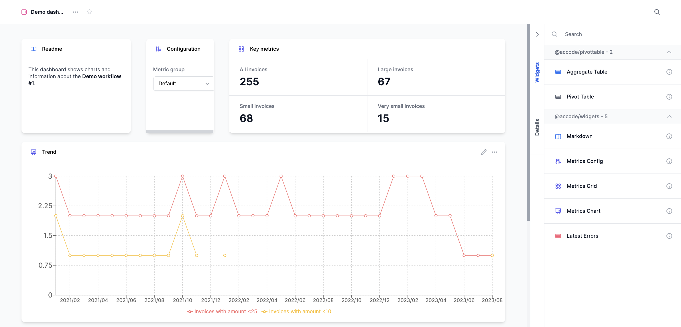
Readme
A Readme is useful when you would like to display text (Markdown) in a dashboard. This could be information about the widgets that are included in the dashboard or how to use some specific functionality.
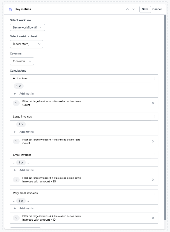
Metrics grid
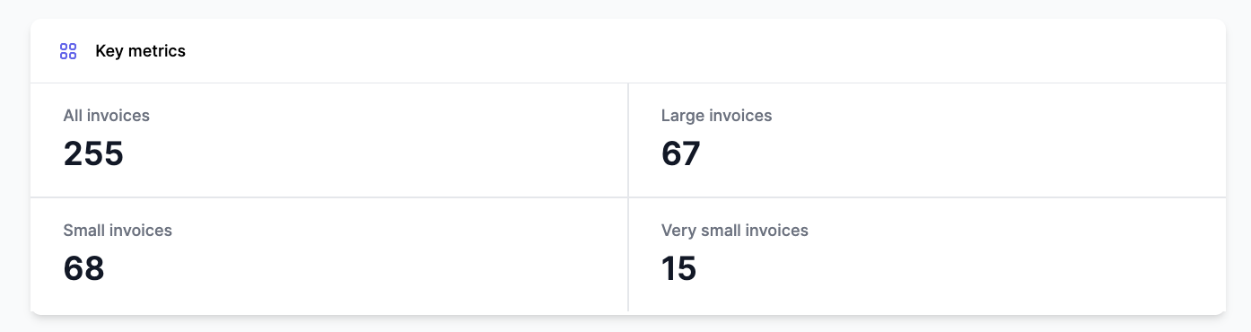
Metrics grid is a way of displaying different KPIs or key metrics in a collected chart. Here we amongst other information show how many invoices have been handled. This widget functions on a specific workflows’ data, and you can make detailed calculations in the widget. To use this widget, you first need to specify on which workflow the widget will base its’ data on. Choose which subset, and then how many columns there should be. In this case, we have 2 columns. Now you can add as many calculations as you want, and they will be ordered into the two columns.
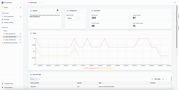
Aggregate table
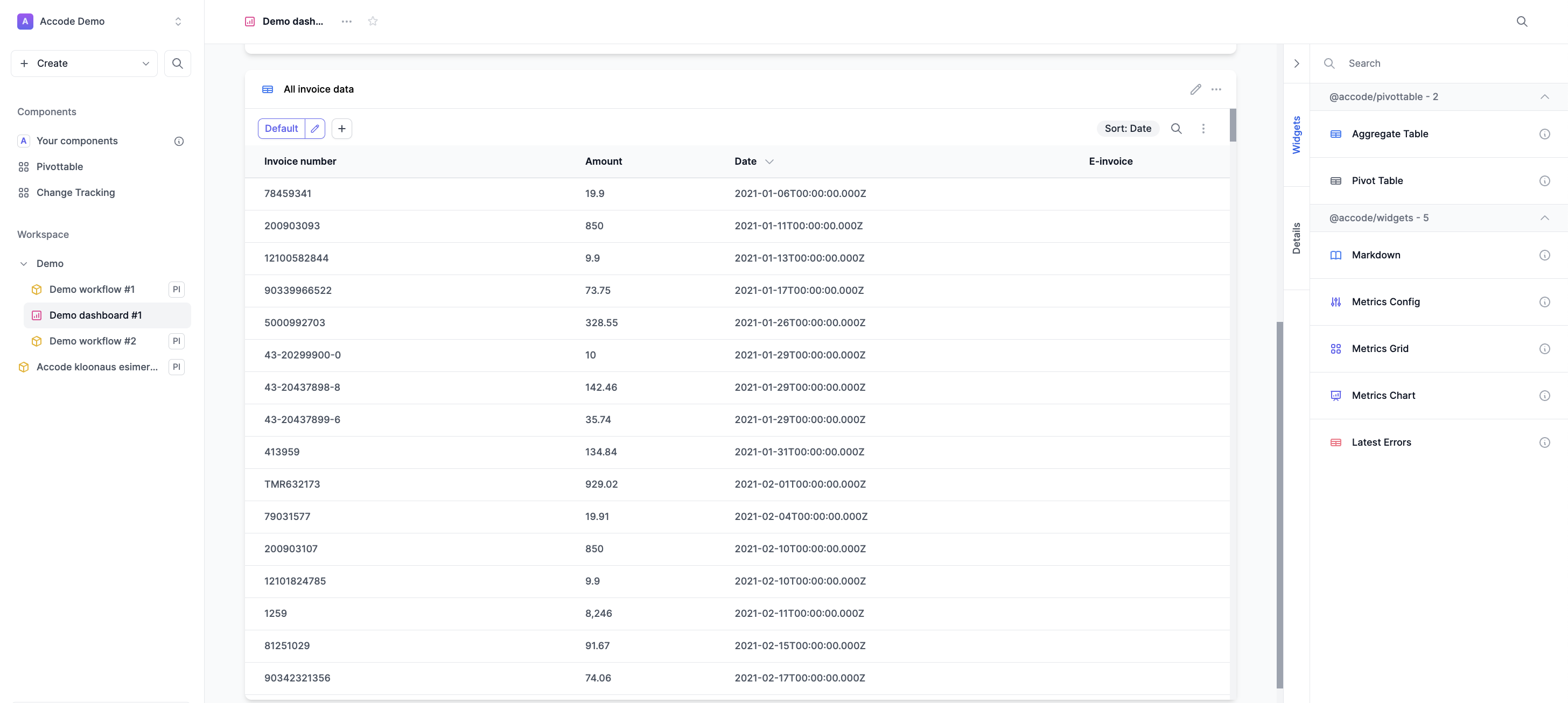
The Aggregate table allows you combine several sources and group and aggregate them into a single table. The values are aggregated according to your configurations, which can include taking the average, sum or mean of the queried data or even writing a custom aggregation function (think Excel). In the example above, we have a table with invoice numbers, the amounts of the invoices, as well as the date and whether it is an e-invoice.