Widgets
A widget is a user interface component that displays information, visualizes data or provides a specific way to interact with their workspace.
Overview
Widgets are the building blocks for dashboards, much like actions are the building blocks for workflows. A widget is a custom user interface that can be used to display almost any type of information. They can be used to show charts and graphs, documents and tables, fill out forms, and authenticate users.
Default widgets
Accode has a set of built-in default widgets that are meant as a starting point for building dashboards.
| Widget | Description |
|---|---|
| Markdown | A widget that allows for creating a Markdown-formatted document. |
| Metrics Configuration | Metrics configuration works like a filter based on subsets you have created in your workflow. Add all your widgets to “Local state”, and use this configuration to quickly switch between subsets. |
| Metrics Grid | A metrics grid is a way of displaying different key metrics in a collected grid. Choose which workflow’s data you would like to visualize. You can make custom calculations based on the selected metrics. |
| Metrics Chart | Allows you to visualize data in a chart. Data calculations works the same way as in a grid, but instead displays the data in a chart. Allows for grouping the data on specific field, in order to generate the values for the x-axis. |
| Latest Errors | A widget that lists latest errors from a specific workflow. |
By installing component packages, you get access to more widgets, with varying use cases. Some widgets are built for displaying information, such as different ways of defining charts and diagrams, while others allow for adding data or accessing information in a more streamlined way.
Action widgets
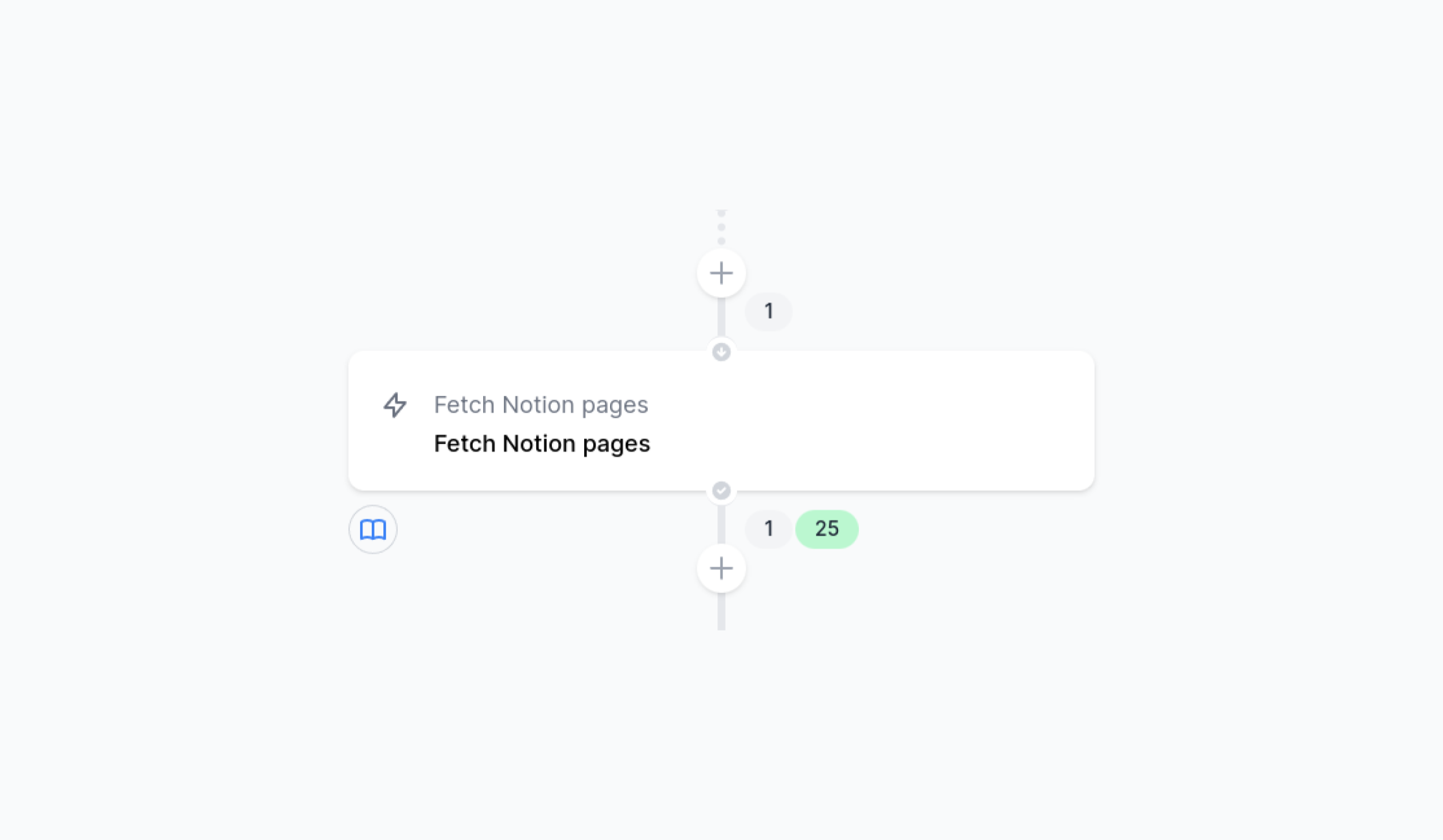
Widgets can also be used while in a workflow, by adding them to an action. In order to add them to an action, open the Action menu (three-dot menu) and select the option called “View widgets”. The widgets will be displayed as icons below the action on the left-hand side, as illustrated by the Fetch Notion pages action in the image below (i.e. the open book icon, denoting a Markdown widget).
Examples
Metrics chart
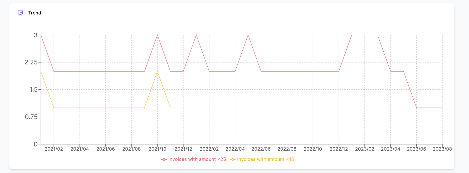
Metrics charts are widgets that shows metrics from workflows in a specific grouped order. In order to create a metrics chart, you will have to chose your metrics from a workflow, chose what field you will group your metrics by and on which axis . Use cases vary from just plain quantity of entities that has passed trough an action to more complicated calculations containing multiple metrics. The example above is a chart showing data from two metrics, ordered on X-axis and by year/month.
Latest errors
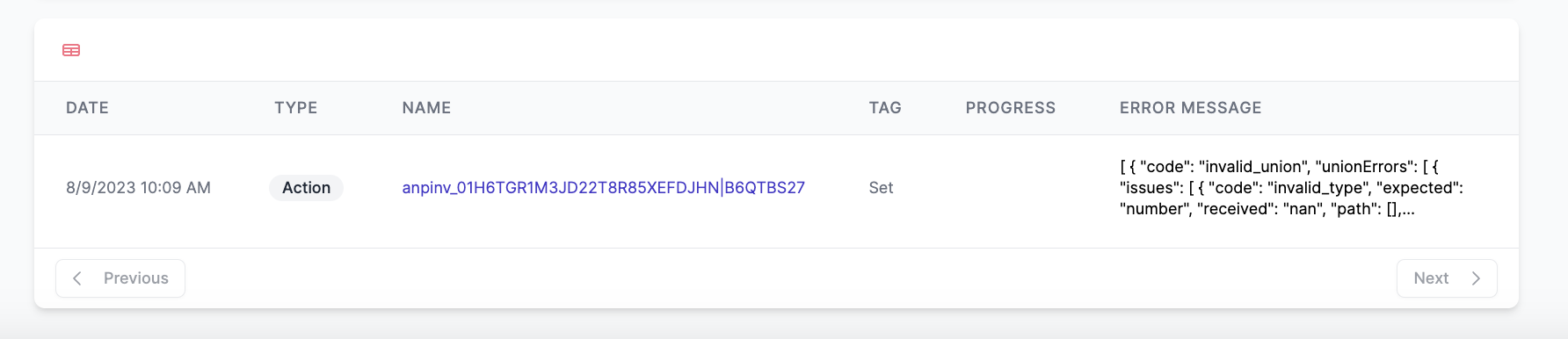
By using the Latest errors widget, you will get a detailed view of all the errors that have occurred in a workflow. It shows you when it happened, what kind of error it is, an error message, and finally a link to the entity that has given rise to the error.
For more information regarding errors, please read the error handling documentation.
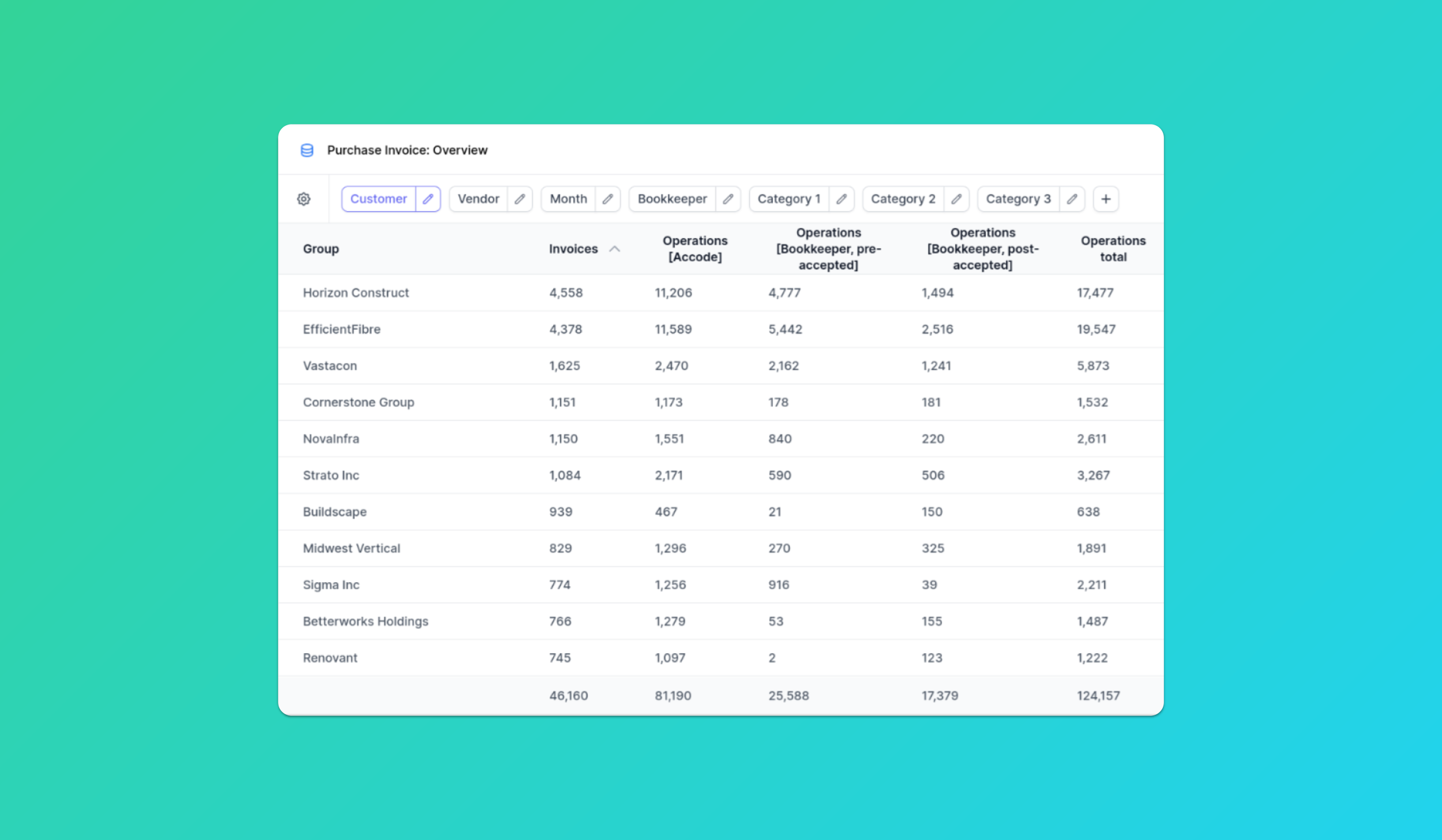
Pivot table
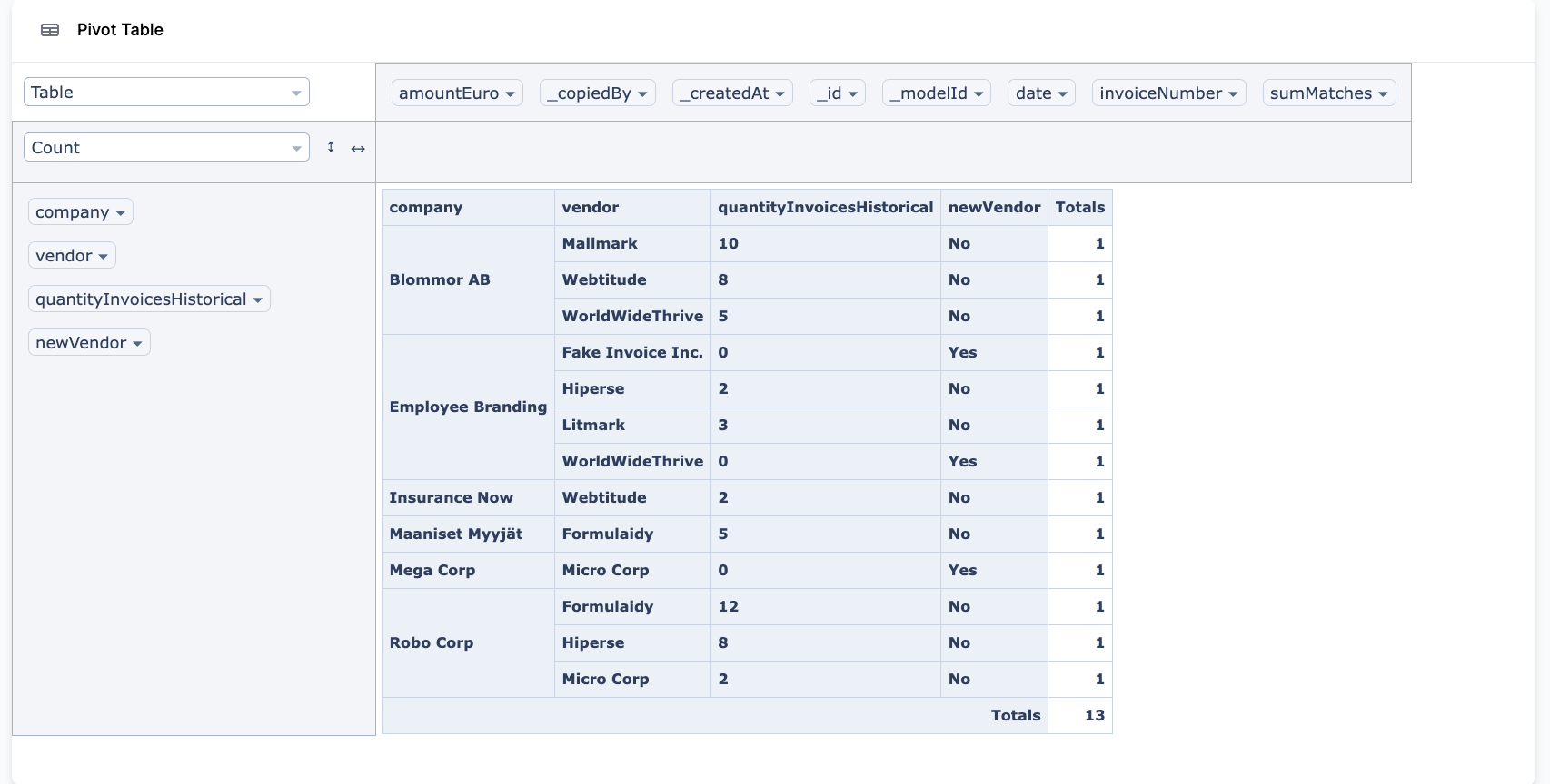
Pivot tables are a powerful tool to summarize, calculate and analyze data that lets you see comparisons, patterns, and trends in your data. It includes almost all common formulas for pivot tables. In order to add calculations, drag and drop them to the axis you need them in. In the example above, we show how many invoices our example companies have from their vendors.